Sidebar
A composable, themeable and customizable sidebar component.
Sidebars are one of the most complex components to build. They are central to any application and often contain a lot of moving parts.
I don't like building sidebars. So I built 30+ of them. All kinds of configurations. Then I extracted the core components into Sidebar*.vue.
We now have a solid foundation to build on top of. Composable. Themeable. Customizable.
Installation
install this component
pnpm dlx shadcn-vue@latest add sidebar
Add the following colors to your CSS file
The command above should install the colors for you. If not, copy and paste the following in your CSS file.
@layer base {
  :root {
    --sidebar-background: 0 0% 98%;
    --sidebar-foreground: 240 5.3% 26.1%;
    --sidebar-primary: 240 5.9% 10%;
    --sidebar-primary-foreground: 0 0% 98%;
    --sidebar-accent: 240 4.8% 95.9%;
    --sidebar-accent-foreground: 240 5.9% 10%;
    --sidebar-border: 220 13% 91%;
    --sidebar-ring: 217.2 91.2% 59.8%;
 }

  .dark {
    --sidebar-background: 240 5.9% 10%;
    --sidebar-foreground: 240 4.8% 95.9%;
    --sidebar-primary: 224.3 76.3% 48%;
    --sidebar-primary-foreground: 0 0% 100%;
    --sidebar-accent: 240 3.7% 15.9%;
    --sidebar-accent-foreground: 240 4.8% 95.9%;
    --sidebar-border: 240 3.7% 15.9%;
    --sidebar-ring: 217.2 91.2% 59.8%;
  }
}
Structure
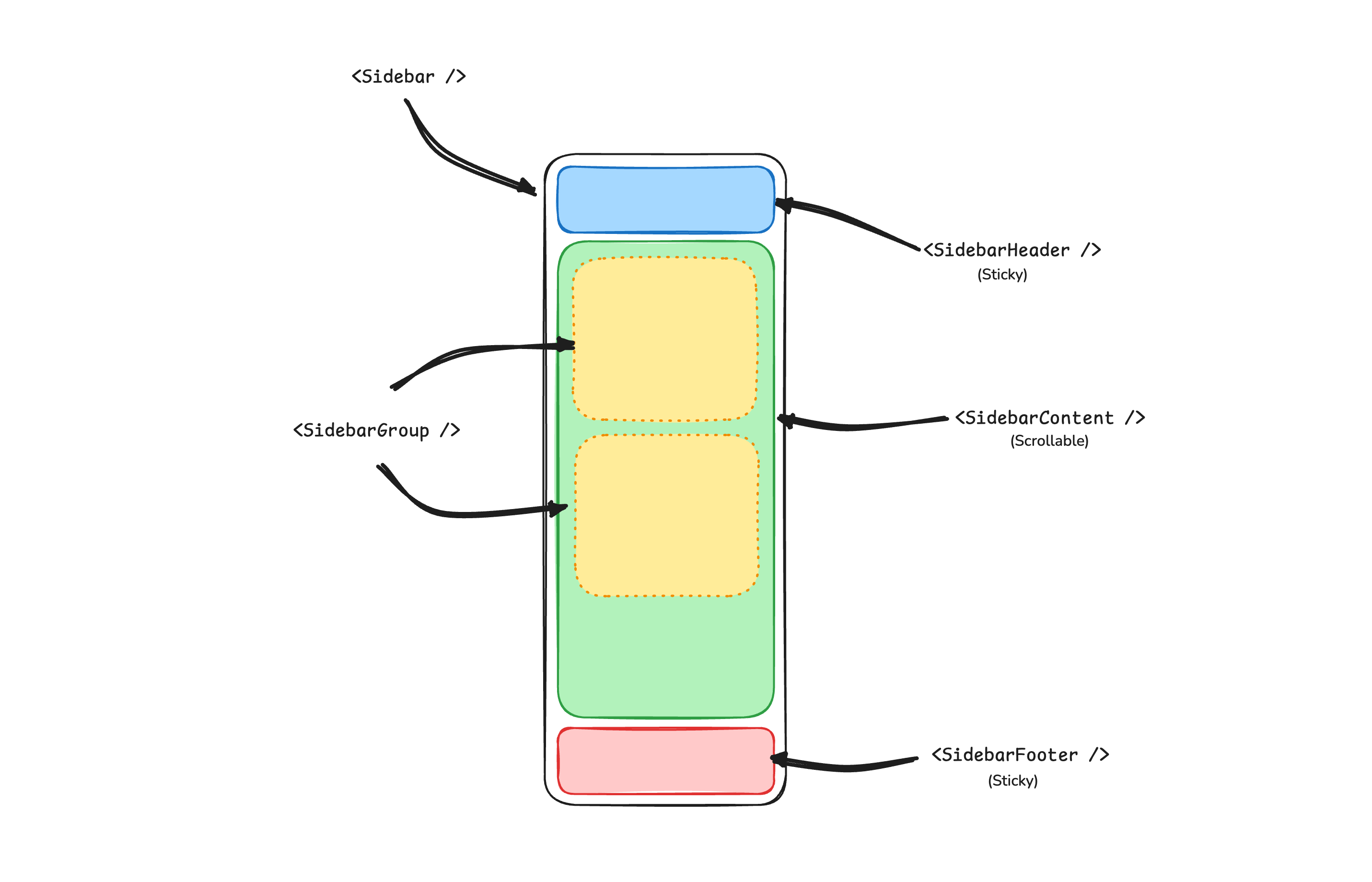
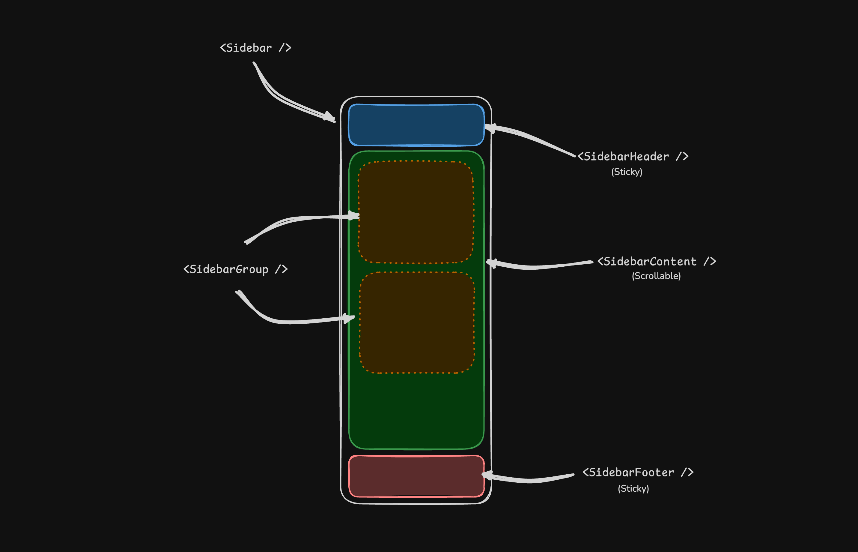
A Sidebar component is composed of the following parts:
SidebarProvider- Handles collapsible state.Sidebar- The sidebar container.SidebarHeaderand SidebarFooter - Sticky at the top and bottom of the sidebarSidebarContent- Scrollable content.SidebarGroup- Section within the SidebarContent.SidebarTrigger- Trigger for the Sidebar
Usage
<script setup lang="ts">
import AppSidebar from '@/components/AppSidebar.vue'
import { SidebarProvider, SidebarTrigger } from '@/components/ui/sidebar'
</script>

<template>
  <SidebarProvider>
    <AppSidebar />
    <main>
      <SidebarTrigger />
      <RouterView />
    </main>
  </SidebarProvider>
</template><script setup lang="ts">
import {
Sidebar,
SidebarContent,
SidebarFooter,
SidebarGroup,
SidebarHeader,
} from '@/components/ui/sidebar'
</script>
<template>
<Sidebar>
<SidebarHeader />
<SidebarContent>
<SidebarGroup />
<SidebarGroup />
</SidebarContent>
<SidebarFooter />
</Sidebar>
</template>Your First Sidebar
Let's start with the most basic sidebar A collapsible sidebar with a menu.
Add a SidebarProvider and SidebarTrigger at the root of your application.
<script setup lang="ts">
import { SidebarProvider, SidebarTrigger } from "@/components/ui/sidebar";
import AppSidebar from "@/components/AppSidebar.vue";
</script>

<template>
  <SidebarProvider>
    <AppSidebar />
    <main>
      <SidebarTrigger />
      <slot />
    </main>
  </SidebarProvider>
</template>Create a new sidebar component at @/components/AppSidebar.vue.
<script setup lang="ts">
import { Sidebar, SidebarContent } from "@/components/ui/sidebar";
</script>

<template>
  <Sidebar>
    <SidebarContent />
  </Sidebar>
</template>Now, let's add a SidebarMenu to the sidebar
We'll use the SidebarMenu component in a SidebarGroup.
<script setup lang="ts">
import { Calendar, Home, Inbox, Search, Settings } from "lucide-vue-next"
import {
  Sidebar,
  SidebarContent,
  SidebarGroup,
  SidebarGroupContent,
  SidebarGroupLabel,
  SidebarMenu,
  SidebarMenuButton,
  SidebarMenuItem,
} from "@/components/ui/sidebar"

// Menu items.
const items = [
  {
    title: "Home",
    url: "#",
    icon: Home,
  },
  {
    title: "Inbox",
    url: "#",
    icon: Inbox,
  },
  {
    title: "Calendar",
    url: "#",
    icon: Calendar,
  },
  {
    title: "Search",
    url: "#",
    icon: Search,
  },
  {
    title: "Settings",
    url: "#",
    icon: Settings,
  },
];
</script>

<template>
  <Sidebar>
    <SidebarContent>
      <SidebarGroup>
        <SidebarGroupLabel>Application</SidebarGroupLabel>
        <SidebarGroupContent>
          <SidebarMenu>
              <SidebarMenuItem v-for="item in items" :key="item.title">
                <SidebarMenuButton asChild>
                    <a :href="item.url">
                      <component :is="item.icon" />
                      <span>{{item.title}}</span>
                    </a>
                </SidebarMenuButton>
              </SidebarMenuItem>
          </SidebarMenu>
        </SidebarGroupContent>
      </SidebarGroup>
    </SidebarContent>
  </Sidebar>
</template>You've created your first sidebar
Components
The components in the Sidebar*.vue files are built to be composable i.e you build your sidebar by putting the provided components together. They also compose well with other shadcn-vue components such as DropdownMenu, Collapsible, Dialog, etc.
If you need to change the code in the Sidebar*.vue files, you are encourage to do so. The code is yours. Use the provided components as a starting point to build your own
In the next sections, we'll go over each component and how to use them.
SidebarProvider
The SidebarProvider component is used to provide the sidebar context to the Sidebar component. You should always wrap your application in a SidebarProvider component.
Props
| Name | Type | Description |
|---|---|---|
defaultOpen | boolean | Default open state of the sidebar. |
open | boolean | Open state of the sidebar (controlled). |
onOpenChange | (open: boolean) => void | Sets open state of the sidebar (controlled). |
Width
If you have a single sidebar in your application, you can use the SIDEBAR_WIDTH and SIDEBAR_WIDTH_MOBILE constants in @/components/ui/sidebar/utils.ts to set the width of the sidebar
export const SIDEBAR_WIDTH = "16rem";
export const SIDEBAR_WIDTH_MOBILE = "18rem";For multiple sidebars in your application, you can use the style prop to set the width of the sidebar
To set the width of the sidebar, you can use the --sidebar-width and --sidebar-width-mobile CSS variables in the style prop.
<template>
  <SidebarProvider
    style="--sidebar-width: 20rem; --sidebar-width-mobile: 20rem;"
  >
    <Sidebar />
  </SidebarProvider>
</template>This will not only handle the width of the sidebar but also the layout spacing.
Keyboard Shortcut
The SIDEBAR_KEYBOARD_SHORTCUT variable in @/components/ui/sidebar/utils.ts is used to set the keyboard shortcut used to open and close the sidebar
To trigger the sidebar, you use the cmd+b keyboard shortcut on Mac and ctrl+b on Windows.
You can change the keyboard shortcut by changing the value of the SIDEBAR_KEYBOARD_SHORTCUT variable.
export const SIDEBAR_KEYBOARD_SHORTCUT = "b";Persisted State
The SidebarProvider supports persisting the sidebar state across page reloads and server-side rendering. It uses cookies to store the current state of the sidebar. When the sidebar state changes, a default cookie named sidebar_state is set with the current open/closed state. This cookie is then read on subsequent page loads to restore the sidebar state.
To persist sidebar state in SSR, set up your SidebarProvider in App.vue like this:
<!-- with Nuxt -->
<script setup lang="ts">
import { SidebarProvider, SidebarTrigger } from "@/components/ui/sidebar"
import AppSidebar from "@/components/AppSidebar.vue"

const defaultOpen = useCookie<boolean>("sidebar_state");
</script>

<template>
  <SidebarProvider :defaultOpen="defaultOpen">
    <AppSidebar />
    <main>
      <SidebarTrigger />
      <RouterView />  <!-- or <slot /> -->
    </main>
  </SidebarProvider>
</template>You can change the name of the cookie by updating the SIDEBAR_COOKIE_NAME variable in sidebar/utils.ts.
export const SIDEBAR_COOKIE_NAME = "sidebar_state"Sidebar
The main Sidebar component used to render a collapsible sidebar
<script setup lang="ts">
import { Sidebar } from "@/components/ui/sidebar";
</script>

<template>
  <Sidebar />
</template>Props
| Property | Type | Description |
|---|---|---|
side | left or right | The side of the sidebar |
variant | sidebar, floating, or inset | The variant of the sidebar |
collapsible | offcanvas, icon, or none | Collapsible state of the sidebar |
side
Use the side prop to change the side of the sidebar
Available options are left and right.
<Sidebar side="left | right" />variant
Use the variant prop to change the variant of the sidebar
Available options are sidebar, floating and inset.
<Sidebar variant="sidebar | floating | inset" />Note: If you use the inset variant, remember to wrap your main content in a SidebarInset component.
<template>
  <SidebarProvider>
    <Sidebar variant="inset">
      <SidebarInset>
        <main>
          <slot />
        </main>
      </SidebarInset>
    </Sidebar>
  </SidebarProvider>
</template>collapsible
Use the collapsible prop to make the sidebar collapsible
Available options are offcanvas, icon and none.
<Sidebar collapsible="offcanvas | icon | none" />| Prop | Description |
|---|---|
offcanvas | A collapsible sidebar that slides in from the left or right. |
icon | A sidebar that collapses to icons. |
none | A non-collapsible sidebar |
useSidebar
The useSidebar composable is used to control the sidebar.
<script setup lang="ts">
import { useSidebar } from "@/components/ui/sidebar";

const {
  state,
  open,
  setOpen,
  openMobile,
  setOpenMobile,
  isMobile,
  toggleSidebar,
} = useSidebar()
</script>| Property | Type | Description |
|---|---|---|
state | expanded or collapsed | The current state of the sidebar. |
open | boolean | Whether the sidebar is open. |
setOpen | (open: boolean) => void | Sets the open state of the sidebar. |
openMobile | boolean | Whether the sidebar is open on mobile. |
setOpenMobile | (open: boolean) => void | Sets the open state of the sidebar on mobile. |
isMobile | boolean | Whether the sidebar is on mobile. |
toggleSidebar | () => void | Toggles the sidebar. Desktop and mobile. |
SidebarHeader
Use the SidebarHeader component to add a sticky header to the sidebar
The following example adds a <DropdownMenu> to the SidebarHeader.
<template>
  <Sidebar>
    <SidebarHeader>
      <SidebarMenu>
        <SidebarMenuItem>
          <DropdownMenu>
            <DropdownMenuTrigger asChild>
                <SidebarMenuButton>
                  Select Workspace
                  <ChevronDown class="ml-auto" />
                </SidebarMenuButton>
            </DropdownMenuTrigger>
            <DropdownMenuContent class="w-[--bits-dropdown-menu-anchor-width]">
              <DropdownMenuItem>
                <span>Acme Inc</span>
              </DropdownMenuItem>
              <DropdownMenuItem>
                <span>Acme Corp.</span>
              </DropdownMenuItem>
            </DropdownMenuContent>
          </DropdownMenu>
        </SidebarMenuItem>
      </SidebarMenu>
    </SidebarHeader>
  </Sidebar>
</template>SidebarFooter
Use the SidebarFooter component to add a sticky footer to the sidebar
The following example adds a <DropdownMenu> to the SidebarFooter.
<template>
  <SidebarProvider>
    <Sidebar>
      <SidebarHeader />
      <SidebarContent />
      <SidebarFooter>
        <SidebarMenu>
          <SidebarMenuItem>
            <DropdownMenu>
              <DropdownMenuTrigger asChild>
                <SidebarMenuButton>
                  <User2 /> Username
                  <ChevronUp class="ml-auto" />
                </SidebarMenuButton>
              </DropdownMenuTrigger>
              <DropdownMenuContent
                side="top"
                class="w-[--reka-popper-anchor-width]"
              >
                <DropdownMenuItem>
                  <span>Account</span>
                </DropdownMenuItem>
                <DropdownMenuItem>
                  <span>Billing</span>
                </DropdownMenuItem>
                <DropdownMenuItem>
                  <span>Sign out</span>
                </DropdownMenuItem>
              </DropdownMenuContent>
            </DropdownMenu>
          </SidebarMenuItem>
        </SidebarMenu>
      </SidebarFooter>
    </Sidebar>
  </SidebarProvider>
</template>SidebarContent
The SidebarContent component is used to wrap the content of the sidebar This is where you add your SidebarGroup components. It is scrollable.
<template>
  <Sidebar>
    <SidebarContent>
      <SidebarGroup />
      <SidebarGroup />
    </SidebarContent>
  </Sidebar>
</template>SidebarGroup
Use the SidebarGroup component to create a section within the sidebar
A SidebarGroup has a SidebarGroupLabel, a SidebarGroupContent and an optional SidebarGroupAction.
<template>
  <Sidebar>
    <SidebarContent>
      <SidebarGroup>
        <SidebarGroupLabel>Application</SidebarGroupLabel>
        <SidebarGroupAction>
          <Plus /> <span class="sr-only">Add Project</span>
        </SidebarGroupAction>
        <SidebarGroupContent></SidebarGroupContent>
      </SidebarGroup>
    </SidebarContent>
  </Sidebar>
</template>Collapsible SidebarGroup
To make a SidebarGroup collapsible, wrap it in a Collapsible.
<template>
  <Collapsible defaultOpen class="group/collapsible">
    <SidebarGroup>
      <SidebarGroupLabel asChild>
        <CollapsibleTrigger>
          Help
          <ChevronDown class="ml-auto transition-transform group-data-[state=open]/collapsible:rotate-180" />
        </CollapsibleTrigger>
      </SidebarGroupLabel>
      <CollapsibleContent>
        <SidebarGroupContent />
      </CollapsibleContent>
    </SidebarGroup>
  </Collapsible>
</template>Note: We wrap the CollapsibleTrigger in a SidebarGroupLabel to render a button.
SidebarGroupAction
Use the SidebarGroupAction component to add an action to a SidebarGroup.
<template>
  <SidebarGroup>
    <SidebarGroupLabel>Projects</SidebarGroupLabel>
    <SidebarGroupAction title="Add Project">
      <Plus /> <span class="sr-only">Add Project</span>
    </SidebarGroupAction>
    <SidebarGroupContent />
  </SidebarGroup>
</template>SidebarMenu
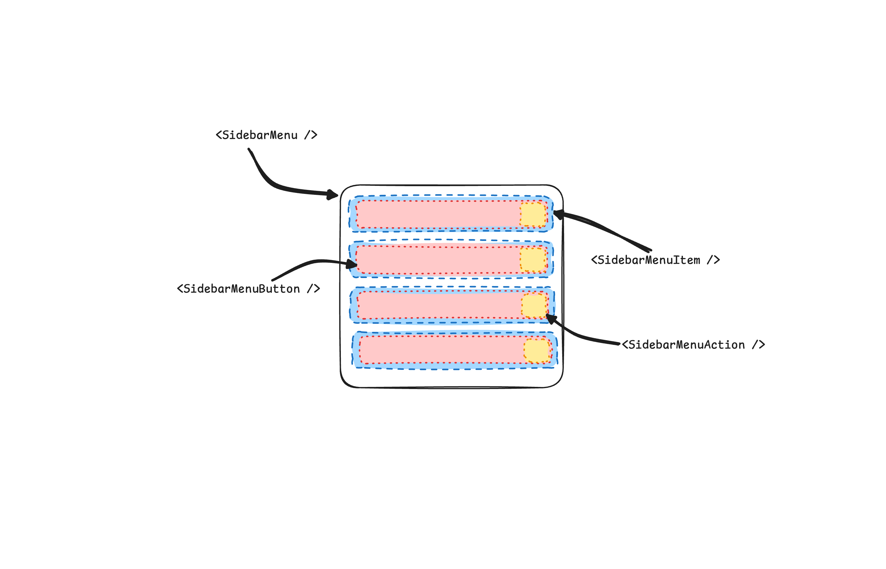
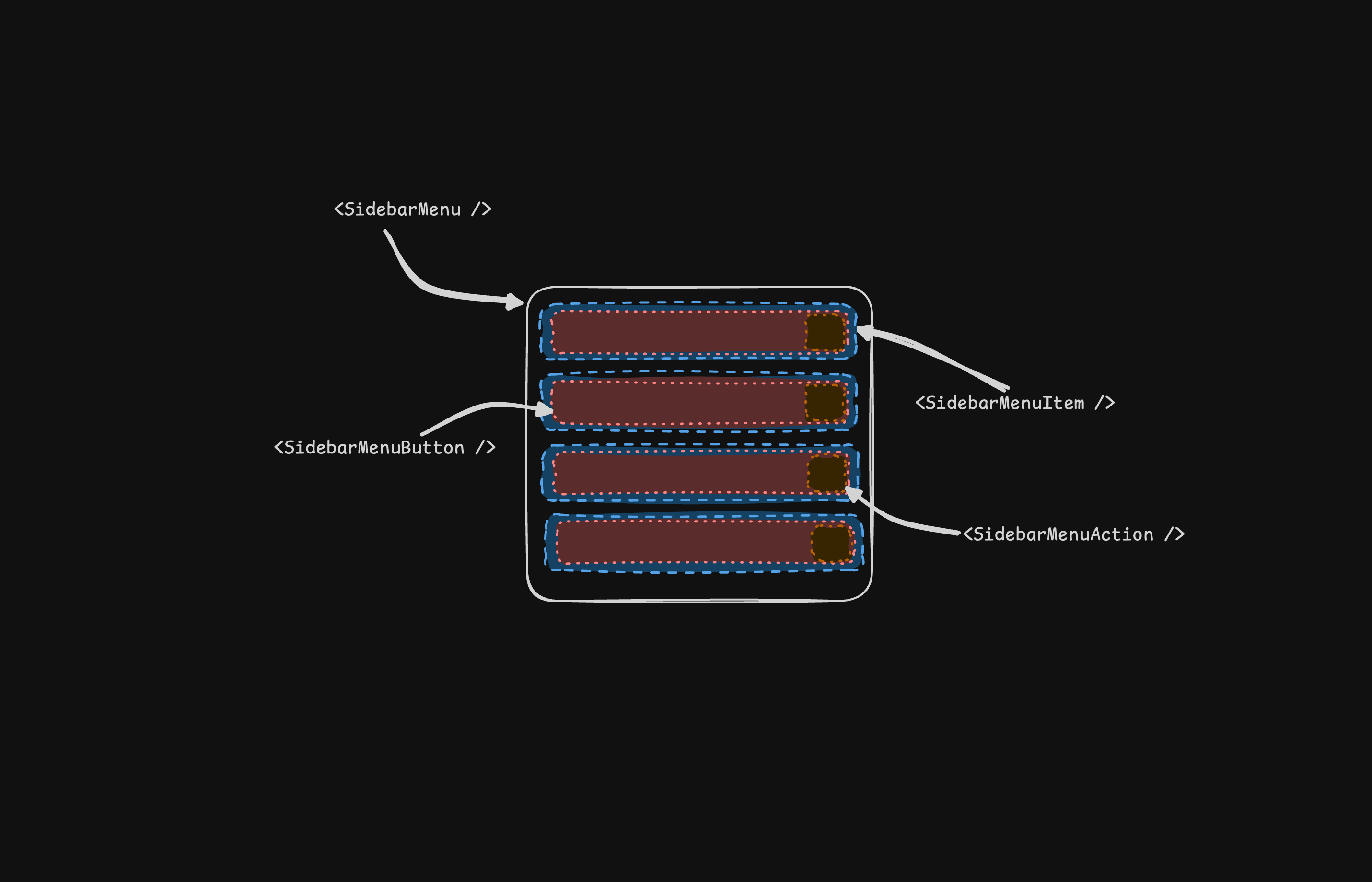
The SidebarMenu component is used for building a menu within a SidebarGroup.
A SidebarMenu is composed of SidebarMenuItem, SidebarMenuButton, SidebarMenuAction, and SidebarMenuSub components.
Here's an example of a SidebarMenu component rendering a list of projects.
<template>
<Sidebar>
  <SidebarContent>
    <SidebarGroup>
      <SidebarGroupLabel>Projects</SidebarGroupLabel>
      <SidebarGroupContent>
        <SidebarMenu>
            <SidebarMenuItem v-for="project in projects" :key="project.name">
              <SidebarMenuButton asChild>
                <a :href="project.url">
                  <component :is="project.icon" />
                  <span>{{project.name}}</span>
                </a>
              </SidebarMenuButton>
            </SidebarMenuItem>
        </SidebarMenu>
      </SidebarGroupContent>
    </SidebarGroup>
  </SidebarContent>
</Sidebar>
</template>SidebarMenuButton
The SidebarMenuButton component is used to render a menu button within a SidebarMenuItem.
Link or Anchor
By default, the SidebarMenuButton renders a button, but you can use the asChild prop to render a different component such as an <a> tag.
<template>
  <SidebarMenuButton asChild>
    <a href="#">Home</a>
  </SidebarMenuButton>
</template>Icon and Label
You can render an icon and a truncated label inside the button. Remember to wrap the label in a <span> tag.
<template>
  <SidebarMenuButton asChild>
    <a href="#">
      <Home />
      <span>Home</span>
    </a>
  </SidebarMenuButton>
</template>isActive
Use the isActive prop to mark a menu item as active.
<template>
  <SidebarMenuButton asChild isActive>
    <a href="#">Home</a>
  </SidebarMenuButton>
</template>SidebarMenuAction
The SidebarMenuAction component is used to render a menu action within a SidebarMenuItem.
This button works independently of the SidebarMenuButton i.e. you can have the SidebarMenuButton as a clickable link and the SidebarMenuAction as a button.
<template>
  <SidebarMenuItem>
    <SidebarMenuButton asChild>
      <a href="#">
        <Home />
        <span>Home</span>
      </a>
    </SidebarMenuButton>
    <SidebarMenuAction>
      <Plus /> <span class="sr-only">Add Project</span>
    </SidebarMenuAction>
  </SidebarMenuItem>
</template>DropdownMenu
Here's an example of a SidebarMenuAction component rendering a DropdownMenu.
<template>
<SidebarMenuItem>
  <SidebarMenuButton asChild>
    <a href="#">
      <Home />
      <span>Home</span>
    </a>
  </SidebarMenuButton>
  <DropdownMenu>
    <DropdownMenuTrigger asChild>
      <SidebarMenuAction>
        <MoreHorizontal />
      </SidebarMenuAction>
    </DropdownMenuTrigger>
    <DropdownMenuContent side="right" align="start">
      <DropdownMenuItem>
        <span>Edit Project</span>
      </DropdownMenuItem>
      <DropdownMenuItem>
        <span>Delete Project</span>
      </DropdownMenuItem>
    </DropdownMenuContent>
  </DropdownMenu>
</SidebarMenuItem>
</template>SidebarMenuSub
The SidebarMenuSub component is used to render a submenu within a SidebarMenu.
Use SidebarMenuSubItem and SidebarMenuSubButton to render a submenu item.
<template>
  <SidebarMenuItem>
    <SidebarMenuButton />
    <SidebarMenuSub>
      <SidebarMenuSubItem>
        <SidebarMenuSubButton />
      </SidebarMenuSubItem>
      <SidebarMenuSubItem>
        <SidebarMenuSubButton />
      </SidebarMenuSubItem>
    </SidebarMenuSub>
  </SidebarMenuItem>
</template>Collapsible SidebarMenu
To make a SidebarMenu component collapsible, wrap it and the SidebarMenuSub components in a Collapsible.
<template>
  <SidebarMenu>
    <Collapsible defaultOpen class="group/collapsible">
      <SidebarMenuItem>
        <CollapsibleTrigger asChild>
          <SidebarMenuButton />
        </CollapsibleTrigger>
        <CollapsibleContent>
          <SidebarMenuSub>
            <SidebarMenuSubItem />
          </SidebarMenuSub>
        </CollapsibleContent>
      </SidebarMenuItem>
    </Collapsible>
  </SidebarMenu>
</template>SidebarMenuBadge
The SidebarMenuBadge component is used to render a badge within a SidebarMenuItem.
<template>
  <SidebarMenuItem>
    <SidebarMenuButton />
    <SidebarMenuBadge>24</SidebarMenuBadge>
  </SidebarMenuItem>
</template>SidebarMenuSkeleton
The SidebarMenuSkeleton component is used to render a skeleton within a SidebarMenu. You can use this to show a loading state while waiting for data to load.
<template>
  <SidebarMenu>
    <SidebarMenuItem v-for="i in 5" :key="i">
      <SidebarMenuSkeleton />
    </SidebarMenuItem>
  </SidebarMenu>
</template>SidebarSeparator
The SidebarSeparator component is used to render a separator within a Sidebar.
<template>
  <Sidebar>
    <SidebarHeader />
    <SidebarSeparator />
    <SidebarContent>
      <SidebarGroup />
      <SidebarSeparator />
      <SidebarGroup />
    </SidebarContent>
  </Sidebar>
</template>SidebarTrigger
Use the SidebarTrigger component to render a button that toggles the sidebar.
The SidebarTrigger component must be used within a SidebarProvider.
<template>
  <SidebarProvider>
    <Sidebar />
    <main>
      <SidebarTrigger />
    </main>
  </SidebarProvider>
</template>Custom Trigger
To create a custom trigger, you can use the useSidebar composable.
<script setup lang="ts">
import { useSidebar } from "@/components/ui/sidebar";
const { toggleSidebar } = useSidebar();
</script>

<template>
  <button @click="toggleSidebar">Toggle Sidebar</button>
</template>SidebarRail
The SidebarRail component is used to render a rail within a Sidebar. This rail can be used to toggle the sidebar
<template>
  <Sidebar>
    <SidebarHeader />
    <SidebarContent>
      <SidebarGroup />
    </SidebarContent>
    <SidebarFooter />
    <SidebarRail />
  </Sidebar>
</template>Controlled Sidebar
Use the open prop and @update:open emit (or v-model:open) to control the sidebar state.
<script setup lang="ts">
import { SidebarProvider, Sidebar } from "@/components/ui/sidebar";
import { ref } from "vue"

const open = ref(false)
</script>

<template>
  <SidebarProvider v-model:open="open">
    <Sidebar />
  </SidebarProvider>
</template>Theming
We use the following CSS variables to theme the sidebar
@layer base {
  :root {
    --sidebar-background: 0 0% 98%;
    --sidebar-foreground: 240 5.3% 26.1%;
    --sidebar-primary: 240 5.9% 10%;
    --sidebar-primary-foreground: 0 0% 98%;
    --sidebar-accent: 240 4.8% 95.9%;
    --sidebar-accent-foreground: 240 5.9% 10%;
    --sidebar-border: 220 13% 91%;
    --sidebar-ring: 217.2 91.2% 59.8%;
  }

  .dark {
    --sidebar-background: 240 5.9% 10%;
    --sidebar-foreground: 240 4.8% 95.9%;
    --sidebar-primary: 0 0% 98%;
    --sidebar-primary-foreground: 240 5.9% 10%;
    --sidebar-accent: 240 3.7% 15.9%;
    --sidebar-accent-foreground: 240 4.8% 95.9%;
    --sidebar-border: 240 3.7% 15.9%;
    --sidebar-ring: 217.2 91.2% 59.8%;
  }
}
We intentionally use different variables for the sidebar and the rest of the application to make it easy to have a sidebar that is styled differently from the rest of the application. Think a sidebar with a darker shade from the main application.
Styling
Here are some tips for styling the sidebar based on different states.
- Styling an element based on the sidebar collapsible state. The following will hide the
SidebarGroupwhen the sidebar is iniconmode.
<template>
  <Sidebar collapsible="icon">
    <SidebarContent>
      <SidebarGroup class="group-data-[collapsible=icon]:hidden" />
    </SidebarContent>
  </Sidebar>
</template>- Styling a menu action based on the menu button active state. The following will force the menu action to be visible when the menu button is active.
<template>
  <SidebarMenuItem>
    <SidebarMenuButton />
    <SidebarMenuAction
      class="peer-data-[active=true]/menu-button:opacity-100"
    />
  </SidebarMenuItem>
</template>
You can find more tips on using states for styling in this Twitter thread.